# The toolbar
The different tools that appear in the toolbar when you create templates and tables are described below. The explanations for the toolbar for tab groups can be found in the Create tab groups section.
# 'Table' group

The layout of the templates in ELO is designed using a grid (as an HTML table). Edit this grid using the tools from the Table group.
# New line
Use New line to add a new line to the grid. The new line appears below the currently selected line.
# Delete line
Use Delete line to delete the currently selected line.
# New column
Use New column to add a new column to the grid. The new column appears to the right of the currently selected column.
# Delete column
Use Delete column to delete the currently selected column.
# Merge
Use Merge to connect the selected cell with the cell to the right of it.
# Split
Use Split to disconnect two cells.
# 'Insert' group
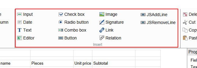
You can add different field types with the tools in the Insert group.
The field types vary in terms of function and setting options. The individual field types are briefly described in the following.
See also the Cell properties and Validation sections.
# Input
Use Input to create an input field in the currently selected cell.
Users can enter text in the form via input fields. Input fields are restricted to one line.

Use the value in the Character count field (in the Properties of the selected cell area) to determine the width of the input field.
# Check box
Create a check box field in the currently selected line with the Check box button. A check box field can contain multiple check boxes. It is also possible to check multiple boxes.
Assign each check box in a check box field a name via the Text field (in the Properties of the selected cell area). There are two ways to do this:

A) Multiple check boxes in a check box field: Use a pipe symbol "|" to separate the names of the different check boxes. A new check box starts after every pipe symbol.
Assign the desired metadata field (or map field) to the cell via the Variable name field (in the Properties of the selected cell area). The selected field applies for all check boxes in the same cell.
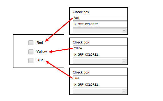
B) Assign check boxes to multiple cells: If you want to assign connected check boxes to multiple check box fields, create one check box per check box field and then assign the same metadata field (or map field) to each check box field.

ELO assigns a value to each check box. You see the value of the current check box in the Current cell contents under value. ELO enters this value into the field (or map field) linked to the check box field when the user clicks a check box in the form. If multiple check boxes are selected, ELO enters the corresponding value into the corresponding field in the metadata sequentially and separates each of the values with a pipe symbol "|".
You can then query these values with a decision node or a script, for example.
# Image
Use the Image button to create an image field in the currently selected cell.
Image fields display image files. Proceed as follows to insert an image into a template:
File the image file to ELO in Administration // ELOwf Base // Images.
Enter a short name.
Information
You need to enter the short name in the form later so that the form designer can find the image. (See step 9.)
Open the form designer.
Select the Refresh button.
Open the desired form.
Open the desired template.
Select the desired cell.
Select Image.

The default image appears in the cell. You see the short name add.png of the default image in the Text field under Properties of the selected cell.
Enter the short name of the image filed at the beginning in the Text field.
Information
You do not have to enter the extension unless it is part of the short name.
The image is then shown.
# JSAddLine
Use JSAddLine to create a button in the currently selected cell that the JS_ADDLINE variable has already been assigned to.
Information
You should not add more than 100 lines with the function JS_ADDLINE. Otherwise, the performance of the forms will be impaired.
There is a limit of 2000 characters.

Buttons with the variable JS_ADDLINE give users the option to duplicate the line above the button when completing the form.
You can change the name of the button in the Text field.
# lines
To duplicate multiple lines, enter the parameter lines: and the number of lines you need in the Validation field. To duplicate the three lines above, for example, enter lines:3.
# max
The attribute max in the validation field of the form designer specifies the maximum number of lines that can be added. Once this number is exceeded, the button will be disabled. If more data is available in the database when the form is loaded, all data is loaded to the form even if the maximum parameter has been exceeded.
# addlineid
If you have multiple JS_AddLine fields on a form, you can increase them using an addlineid in the validation field of the form designer. This ID is used in scripting functions to distinguish between the JS_AddLine fields.
# Date
Use the Date button to create a date field in the currently selected cell.
Users can enter a date via date fields. A calendar icon appears next to the date field. Use the calendar icon to open a calendar and select the date.
Use the value in the Character count field (in the Properties of the selected cell area) to determine the width of the date field.
The date value is automatically entered in the the Validation field (in the Properties of the selected cell area). This ensures that only date entries can be made.
For more information on validation, refer to the Validation section.
# Radio button
Use Radio button to create a radio button field in the currently selected line. A radio button field can contain multiple radio buttons. Only one option can be selected for connected radio buttons.
There are two ways to create radio buttons fields:

A) Multiple radio buttons in a radio button field: Use a pipe symbol "|" to separate the names of the different radio buttons. A new radio button starts after every pipe symbol.
Assign the desired field (or map field) to the cell via the Variable name field (in the Properties of the selected cell area). The selected field applies for all radio buttons in the same cell.
B) Distribute radio buttons to multiple cells: If you want to distribute connected radio buttons to multiple cells, add one radio button field per cell and then assign it the cell the same field (or map field).
Depending on which option the user selects, the respective value is saved to the corresponding field (or map field).
# Signature
Use the Signature button to create a signature field in the currently selected cell. A signature field is used to link signatures to a form.

For the signature field to work, the variable that you enter in the Variable name field (in the Properties of the selected cell area) must follow this pattern:
IX_BLOB_WO_<NAME>
- BLOB: Binary Large OBject
- WO: write once
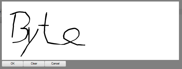
A signature field initially appears as a button that you can open a drawing area with.
You can draw a signature in this space. There are various methods for doing this:
- Mouse: Hold down the left mouse button and write your signature.
- Touch screen device: Sign with your finger.
- Stylus pen: Write your signature with a stylus pen.

Click OK to save the signature.
Information
The signature will not be linked to the form until you have saved the form or forwarded the workflow.
The signature is shown in the form with a timestamp.
# JSRemoveLine
Use the JSRemoveLine button to create a button in the currently selected cell that the JS_REMOVELINE variable has already been assigned to. A button with the variable JS_REMOVELINE is used to delete duplicated lines. This deletes the row in which the button is located.

This button always appears on the form as an X icon. The names of JS_REMOVELINE buttons cannot be changed.
Information
To delete multiple lines, enter the parameter lines: and the number of lines you need in the Validation field. To delete the three lines above, for example, enter lines:3.
# Text
Use the Text button to create a text field in the currently selected cell. If you enter text in an empty cell, the cell automatically turns into a text field.
You can enter any text in text fields. For example, as a name for an adjacent field or information that is permanently displayed.

Text fields also enable users to add explanatory text. This text is initially hidden. Instead, the linked text [more >>] appears. The explanatory text is displayed when you click the link. Clicking [<< less] hides the explanatory text.
Add explanatory text to a text field as follows:
Select a text field

Select the button next to the Text field (in the Properties of the selected cell area).

The Explanatory text dialog box opens.
Enter the desired text.
Select OK.
The text is saved. The dialog box closes. The [more>>] text appears after the main text in the text field.
# Combo box
Use Combo box to create a combo box field in the currently selected cell.
Combo box fields provide a list of terms that can be selected. The respective selected term is saved to the associated field (or map field).

Add list entries via the Text field (in the Properties of the selected cell area). The individual entries are separated by a pipe symbol "|".
Information
Alternatively, you can use keyword lists and user lists. For additional information about this function, refer to the section on Cell properties.
Please note
You cannot use dynamic keyword lists in combo box fields.

Use the Character count field to determine the maximum number of lines that will be displayed in the combo box field. If the value in the Character count field is 1, only the first entry is displayed. All additional entries can be selected via a drop-down menu. If the value is greater than 1, the respective number of entries is displayed. In addition, a scroll bar appears on the side if all available entries cannot be displayed.
# Link
Use Link to create a link field in the currently selected cell.
Use link fields to embed links in websites and documents in forms. For websites, enter the corresponding URL in the URL field. In the case of documents, enter the ELO GUID of the document (including brackets) in the URL field.
Please note
If you do not enter a link text in the Text field, the link will not be displayed.

A left-click on a link to a document opens the external standard browser and downloads the document.
Right-click the link to open a context menu. You have the following options in the context menu:
- Open link: Opens websites in the ELO browser. This does not work for documents.
- Open link in new window: Opens websites in the ELO browser. This does not work for documents.
- Copy link to clipboard: Copies the link to the document or website to the Windows clipboard from where it can be moved to other locations.
# Editor
Use Editor to create an editor field in the currently selected cell.
The user can enter large text blocks in the form via editor fields.

Use the value in the Character count field (in the Properties of the selected cell area) to determine the width of the editor field.
Use the value next to the Character count field to determine the height of the editor field.
# Button
Use the Button function to create a button in the currently selected line that can be linked to your own JavaScript function.

Own script functions must be named according to the following pattern:
JS_<NAME>
In addition, these script functions must be stored in the Edit form header scripts component.
# Relation
You can use the Relation function to create a field in the currently selected cell that retrieves metadata from another entry.
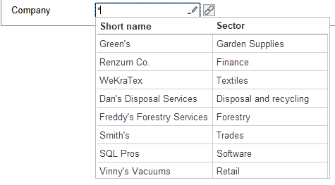
A form field of the type Relation is linked to a metadata field of the type Relation. Fields of the type Relation are linked to one or more metadata forms that can be used for relations. This enables you to transfer metadata from one entry to another.
An automatically generated keyword list is provided for Relation type fields. It consists of the short names of the entries that are linked to the field through the corresponding metadata forms. In addition, up to five priority fields can be displayed in the keyword list.
Information
For more information on creating Relation type fields and corresponding metadata forms, refer to the section Create metadata form > Usage in the documentation Metadata forms and fields (opens new window).
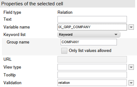
For a Relation type field to work, you need to enter the corresponding Relation metadata field type in the Variable name field under Properties of the selected cell.
You need to enter the group name of the field in the metadata under Keyword list. You do not need to assign a keyword list to the field. This is generated automatically.
The validation value must be relation.
# 'Edit' group

The Edit group contains tools for editing cells.
# Delete
Delete the contents of the selected cell via Delete.
# Cut
Cut out the contents of the selected cell via Cut. Use Paste to insert the copied contents into another cell.
Information
The contents of a cell can also be dragged and dropped onto another cell.
# Copy
Use Copy to copy the contents of the selected cell. Use Paste to insert the copied contents into another cell.
# Insert
Use Paste to insert the contents of a previously cut out or copied line.
# 'System' group

You will find buttons that apply for the entire template in the System group.
# Save
Use Save to save all changes and close the template.
# Apply
Use Apply to save all changes. The template remains open.
# Save and preview
Use Save and preview to save all changes. The form also opens in the ELO browser dialog box. In the ELO browser dialog box, you can check the layout of the form and test some functions. You can also open the ELO debugger from the context menu of the ELO browser.
Please note
Not all scripts and functions will necessarily behave as they do in the actual environment that the form is being used in. You should therefore test the form in an appropriate environment before using it.
Use Close to close the dialog box and go back to the form designer.
# Cancel
Use Cancel to close the template without saving the changes. If there are unsaved changes, you need to confirm that you want to discard them.