# Create tab group
Tab groups are a special type of template. Tab groups are used to structure forms. A form can be split into multiple tabs. The tabs can also be broken down into subtabs. Each tab can include multiple templates, tables, and/or tab groups.
Information
Data set forms for ELO for Mobile Devices must not be divided into tab groups. A data set form must be created as a separate template.
Tab groups are generally added the same way as standard templates. The design and functionality of tab groups, however, differs from the other templates. The following section describes how to create tab groups and includes examples of different configurations.
Open the form designer.
Select the form that you want to add a tab group to.

Select Tab group.
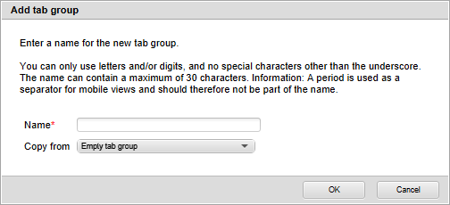
The Add tab group dialog box opens.
Enter a name for the tab group in the Name field.
The same rules as for naming forms apply (See the Create form section).
Optional: Use the Copy from field to apply the settings of an existing template.
Select OK.

The tab group is added. Then, the form designer switches to Edit tab group mode.
Configure the tab group according to your requirements. Keep the following notes in mind:
Tab ID: Assign a unique ID for each tab group. The ID is important when you are using scripts, for example.
Header: Enter a name for the respective tab here. Once you have entered a name and switch to another field, an additional editing line for further tabs appears.
Add component: Select one or more components (templates, tables, or other tab groups) via the drop-down menu in the Add component column. Multiple components can be placed on a tab.
The selected components appear in the column next to Add component. The list in this column can be edited as follows:
- Arrow icons: Use the arrow icons to change the display order of the components. The topmost component in the list also appears at the top in the respective tab.
- X icon: Use the X icon to remove the selected component from the respective tab.
Start element: Use the drop-down menu in the Start element column to select a variable, if required. The variable stands for a form field. When editing a form, the chosen form field is automatically selected when the respective tab is opened. If you do not select a variable, a field will not be automatically selected.
# Example 1: Simple tab group
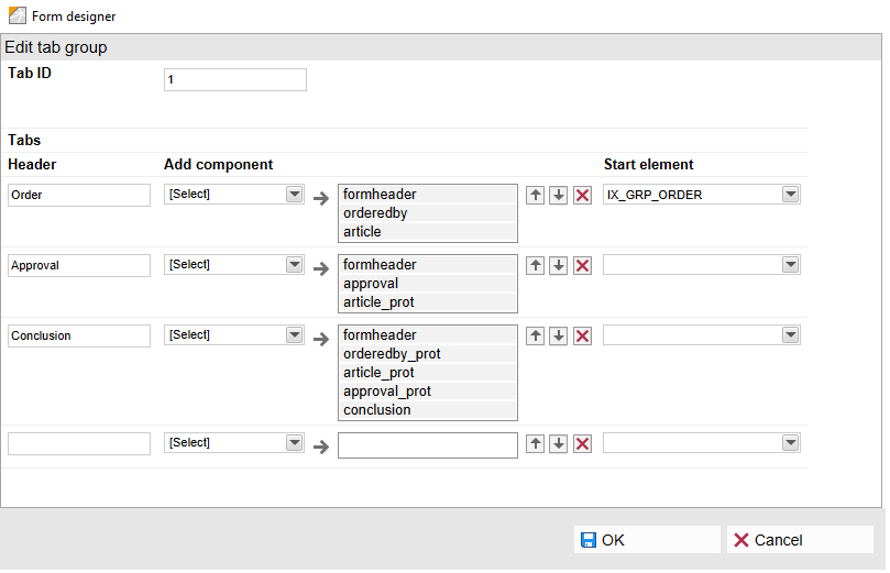
In the example above, the three tabs Order, Approval, and Conclusion were added. The form looks like this:

On the selected Approval tab, the approval template appears in the top part of the form. The items_protection template appears in the lower part. It is a copy of the items template that the user can place an order with. The copy is read-only (designated by _protection) and serves exclusively for displaying the entered values.
# Example 2: Tab group with subgroup
You have the option of creating subgroups for a tab group. The following example illustrates this:
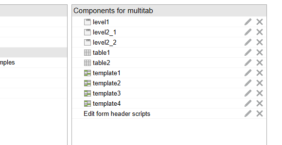
First, we created several templates and table templates. We also created the tab groups level1, level2_1, and level2_2. These are initially empty.

We added Tab1 and Tab2 to the tab group level1. The first tab is connected to the tab group level2_1. The second tab was connected to the tab group level2_2.
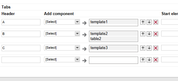
Some tabs were added to the tab groups level2_1 and level2_2. The tabs were assigned components.

The form now has the desired structure.