# Field properties
To edit the properties of a field, select the relevant field in the layout area.
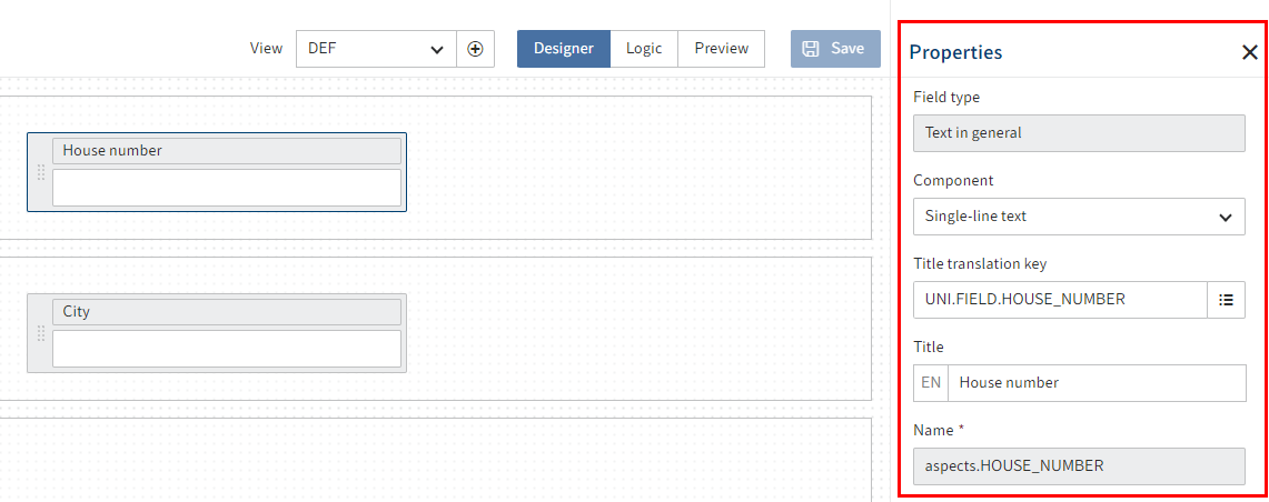
The Properties area opens.
Edit the settings as required.
Different settings are available depending on the field type. Read the following sections for more information.
Select Save.
# General field properties
The following properties are available for all fields:
- Field type: Shows the selected field type. This cannot be changed here.
- Component: Shows the selected data type. This can be changed for some fields.
- Title translation key: Shows the entered translation variable. Can be changed.
- Title: Shows the title in the current display language depending on the Title translation key field.
- Name: Shows the technical name of the field.
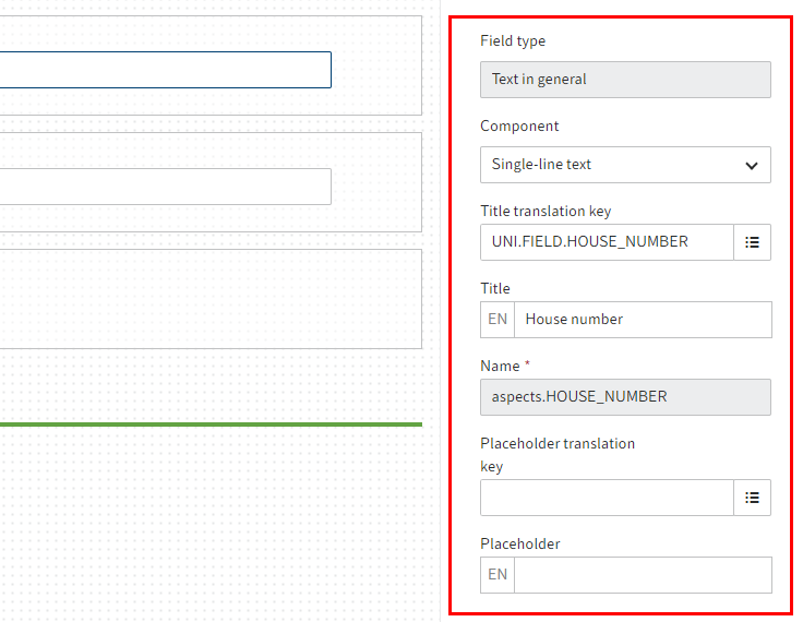
- Placeholder translation key: Shows the translation variable entered for the Placeholder field (see below). Can be changed.
- Placeholder: Here, you can enter example values that help users complete the form. The value is linked to the respective translation variable. The value is shown in the current display language.
- Field size: This option lets you set the display size of the field.
- Mandatory field: If the Mandatory field option is enabled, the form cannot be closed until the field has been completed.
- Disabled: If the Disabled option is enabled, the field is set to Read-only.
Below, you will find an overview of properties that are also available depending on the selected data type.
Information
Only the general properties can be changed for the Relation and Check box field types in the form designer (gen. 2).
# Text fields
Multiple field types or components use the Text data type:
- General text (Single-line text component)
- Long text (Multi-line text component)
- E-mail address
- URL
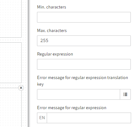
The following properties are available for fields with the Text data type:
- Min. characters: Indicates the minimum number of characters that have to be entered in the field.
- Max. characters: Indicates the maximum number of characters that can be entered in the field.
- Regular expression: Via this field, you can define a regular expression that is used to validate the field content.
- Error message for regular expression translation key: If you want to work with translations, enter a translation variable for the error message.
- Error message for regular expression: Here, you define the message to be shown in the event that validation fails. This is the case if the input does not match the regular expression defined above.
# Number fields

Multiple field types are used to display numbers:
- Integer
- Floating-point number
- Large decimal number
The following properties are available for number fields:
- Min. value: Indicates the smallest value that can be entered in this field.
- Max. value: Indicates the largest value that can be entered in this field.
# Numbers with decimal places
The following properties are available for the Floating-point number and Large decimal number data type fields:
- Number of decimal places: Defines how many decimal places can be entered.
# Floating-point number

The following property is also available for Floating-point number type fields:
Show thousands separators: If this option is enabled, separators are shown for thousands.
The field applies the client display settings as far as possible.
# Date and time fields

Multiple field types are used to select times or time periods:
- Date
- Date and time
- Time
These fields are additional properties for narrowing down the time period that can be selected. For Date_Only e.g.:
- Min. date: Indicates the lower limit for date selection.
- Max. date: Indicates the upper limit for date selection.
# Selection list

The following properties are available for Selection list type fields:
- Name of keyword list: This field is ready-only. It shows the name of the selected keyword list.
Alternatively, Selection list type fields can use the following components.
Refer to the following/linked sections for more information.
# Toggles

The following properties are available for the Toggles component:
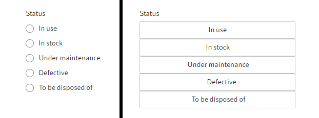
- Display as buttons: Changes the list view to buttons. By default, the values in the list are displayed as radio buttons.
- Arrange horizontally: Arranges the buttons/radio buttons next to one other. With the default settings, they are arranged one below the other.
# Large buttons

Fields with the Large buttons component present the values of a keyword list as tiles.
The selected value is highlighted.
- Arrange horizontally: Arranges the buttons next to one other. The arrangement depends on the available space and the selected size. With the default settings, they are arranged one below the other.
# Phase visualization

Fields with the Phase visualization component present the values of a keyword list as phases of a process.
The values of the field cannot be edited directly via the field. The values of the field can be changed as follows:
- A different view: In the EDIT view of the metadata form, define an aspect view with an editable Selection list type component for the same aspect. The value can be changed in this view. Phase visualization is used for the VIEW view of the metadata form to display the value.
- ELO Flows: For example, the value can be set via the metadata component. For more information on ELO Flows, refer to the ELO Flows (opens new window) documentation.
- Scripting: For more information about scripting with ELO Forms, refer to the ELO Forms scripting (opens new window) documentation.
# User fields

The following properties are available for User type fields:
Restrict selection: Restricts the selection of the field content. You can choose between Both, Groups, or User.
User belonging to a group: If you select Both for Restrict selection, you can narrow the available options down to a specific group.
Registered function: You have the option to use a registered function that returns a list of users. A JSON object with the
usersarray property is expected. The array contains the names or GUIDs of the respective users. The array is processed withCheckoutUsersC.BY_IDS.For more information on registered functions, refer to Programming for ELO > ELO Indexserver programming guide > Adding functionality with registered functions (opens new window), for example.