# Form designer (gen. 2)
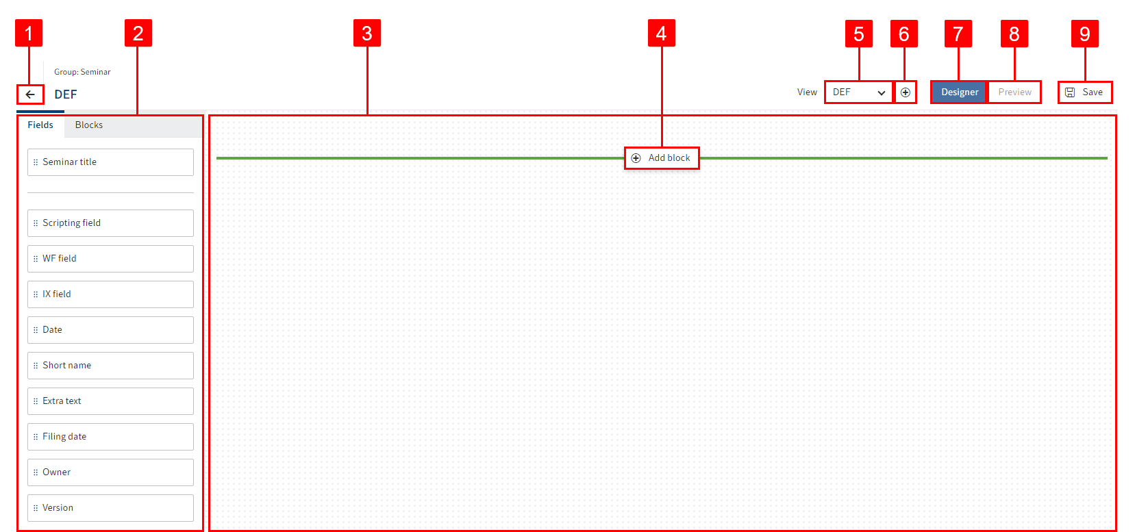
The form designer (gen. 2) contains the following control elements:
- 1 Close: Close (arrow icon) closes the form designer.
- 2 Fields/Elements: You will find all available components for the form on the Fields and Elements tab.
- 3 Layout area: In the layout area, you design the form.
- 4 Add block: Select Add block to add more layout formats in the layout area.
- 5 View: Select the view you want to edit via the View drop-down menu.
- 6 Create view: Select Create view (plus icon) to create a view.
- 7 Designer: If the Designer button is enabled, you are in editing mode. You can change the layout of the form and the field settings.
- 8 Preview: If the Preview button is enabled, you are in preview mode. You can test the form in different variants.
- 9 Save: Select Save to save the form.
# Preview
Once you have placed and saved contents in the layout area, you can switch from editing mode to preview mode.

Select Preview.
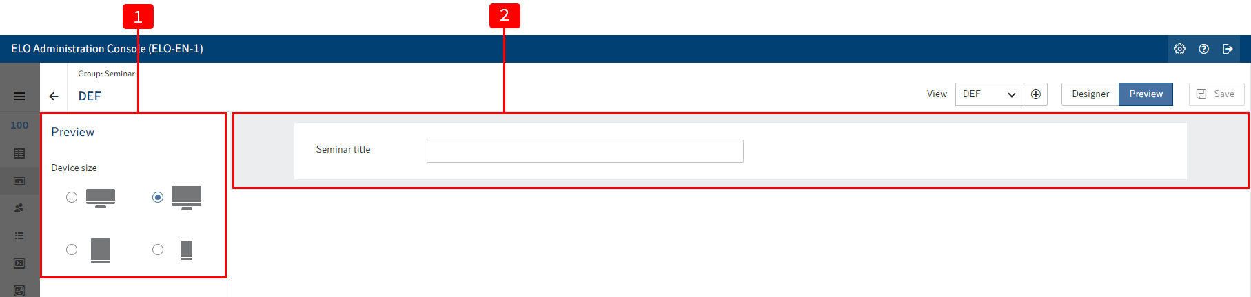
Preview mode is enabled. You will see the form.
Test the form as needed.
The following elements are available:
1 Device size: Display the preview for different device types.
2 Preview area: You see the form fields.
The form behaves as it would in actual use in the client. Fields can be completed to test their functionality.

Example: A field with a validation function also checks whether the input is correct in the preview.